Overview
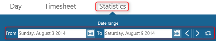
Charts will display the data for the date range you set.
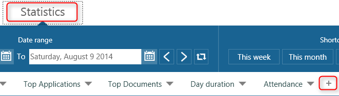
You can have multiple tabs in statistics. To create a new tab click on the + icon next to the rightmost tab.
This will bring up a dialog where you can choose what type of statistics would you like to create.
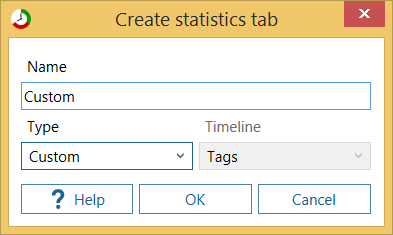
There are four options:
- Top statistics - top groups for each timeline. Use this one if you want to see which applications you used most, which sites you visited the most....
- Day duration statistics - use when you want to see for each day when you came to work and when you left.
- Attendance statistics - use when you want to see on which days you were active
- Custom statistics - use when you want to make a custom chart.
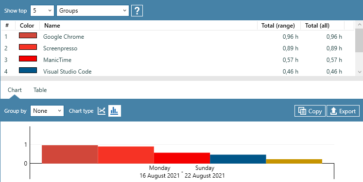
Top charts
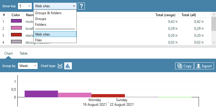
A Top chart will display top groups for selected timeline. For applications timeline this will be most used applications for any given date range. You can see top 5, 10 or 20 groups for each date range. On all timelines except the Tag timeline you can define Categories (you can do this on Day view). If you have categories set up, you can also see them on top charts.
 Example for categories
There are two predefined categories on Documents timeline: Web sites and Documents. To see Top 10 web sites go to Top documents tab (if you don't have one create it) and choose Web sites from the dropdown
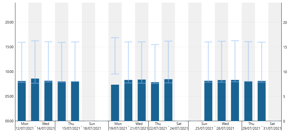
Day duration chart
On the Day view there are three values displayed for every day, Start time, End time and Duration (time between start and end time). This chart shows those values on a chart for each day.
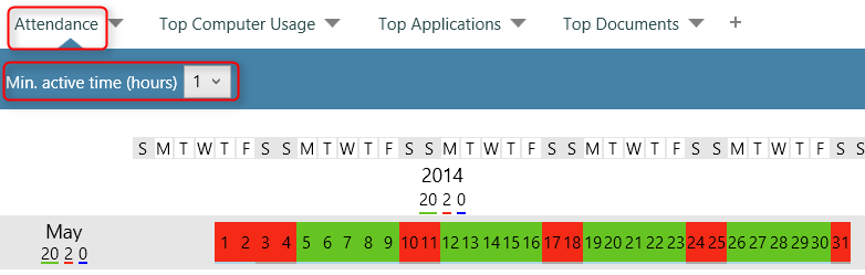
Attendance chart
Attendance view shows on which days you were active. By default it will show days when you were active for one hour or more.
Days marked with green are the ones when there was more than an hour between first and last interaction with the computer. For example, a day with: Start time: 9:30 AM End time: 11:30 AM Duration 2:00:00 would be marked with green.
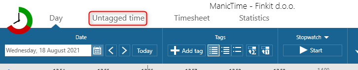
Untagged time chart
Use Untagged time chart to quickly see which days are not tagged or partially tagged.
All you need to do is, go to Untagged time tab.
On the Untagged time report, colors have the following meaning:
- Dark green - everything is tagged
- Light green - tagged time
- Orange - untagged time
- White - no tracked time
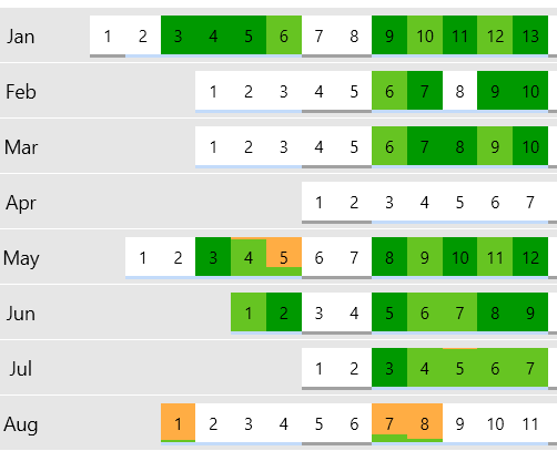
Untagged time statistics
Orange and light green are always together on the rectangle representing each day, but in cases where for example 5 hours is tagged and only a couple of seconds is missing, the day will look as light green. Similarly, on the days when there are no tags, whole rectangle will be orange.
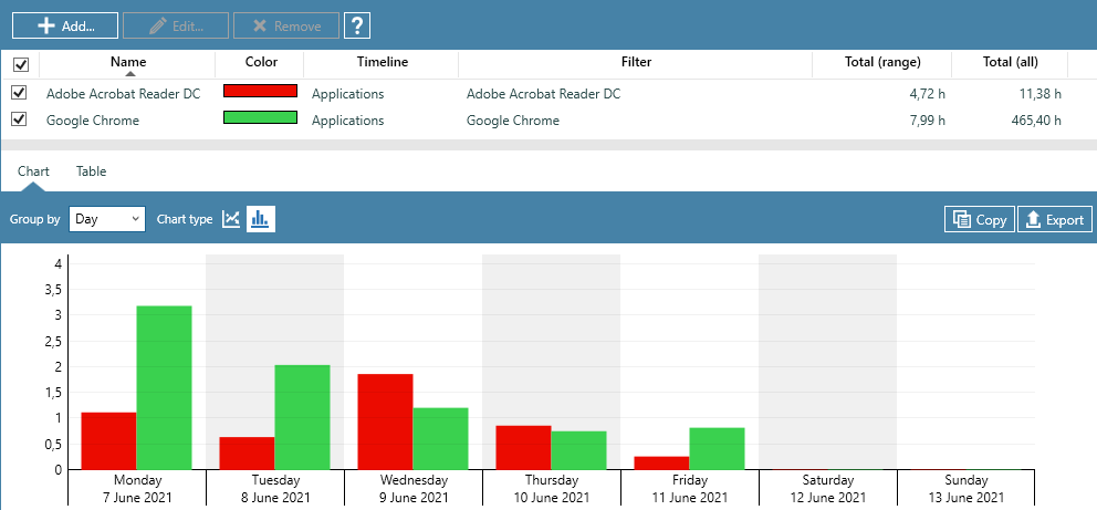
Custom charts
Custom charts allow you to add any value you want to the chart.
For example lets say you want to see a comparison of how much time you spent using Adobe Acrobat Reader vs. Google Chrome in the last week.
- Start by clicking Add
- For timeline select Applications timeline, since applications are on this timeline.
- Now check Adobe Acrobat Reader and click Ok.
- Repeat steps 1 and 2, but in step 3 choose Google Chrome instead of Adobe Acrobat Reader.
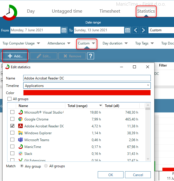
You should now have usage of Adobe Acrobat Reader and Google Chrome on the same chart. Once you have your chart ready, you can then set the date range, group by day, week or month and even export the chart as well as the underlying data.
Lets do one more example. Lets say you work on three projects for a client and these are your tags:
Client 1, Project 1
Client 2, Project 1
Client 2, Project 2
Client 1, Project 1, Activity 1
Client 1, Project 2
Client 1, Project 3
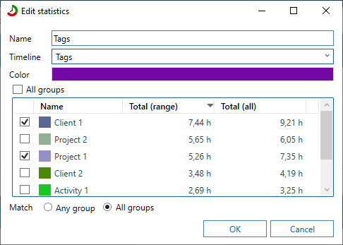
And lets say you want to compare how much time you've worked for Client 1 on Project 1 compared to Project 2. To add tag 'Client 1, Project 1' to chart follow these steps:
- Click Add
- For timeline choose Tag timeline
- Check tags Client 1 and Project 1.
- At the bottom of the dialog click there is a Match setting. Choose All groups.
- Click OK.
- Repeat all steps, but in step 3 select Client 1 and Project 2.
The procedure is very similar to the one we used to add Firefox and IE, but you may be wondering why we chose Match -> All groups.
The following table should explain the difference between Any group and All groups. On the left are my tags, the ones I entered on Day view.
Matching for Client 1, Project 1.
| Tags | Any group | All groups |
|---|---|---|
| Client 1, Project 1 | Yes | Yes |
| Client 2, Project 1 | Yes | No |
| Client 2, Project 2 | No | No |
| Client 1, Project 1, Activity 1 | Yes | Yes |
| Client 1, Project 2 | Yes | No |
So any group is like OR operation, any group will do.
All groups is like AND, all groups must be in the tag you entered.
All groups is only available when you select Tag timeline, because in every other timeline groups don't overlap. For example you can't use Firefox and IE at the same time.
Grouping
On most charts you can group by:
- None - no grouping, just totals
- Day - chart will be grouped by day
- Week - chart will be grouped by week
- Month - chart will be grouped by month
- Year - chart will be grouped by year
So if you want to see top Applications for a year grouped by months, select a year in date range part at the top, then select Group by -> Month
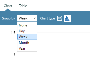
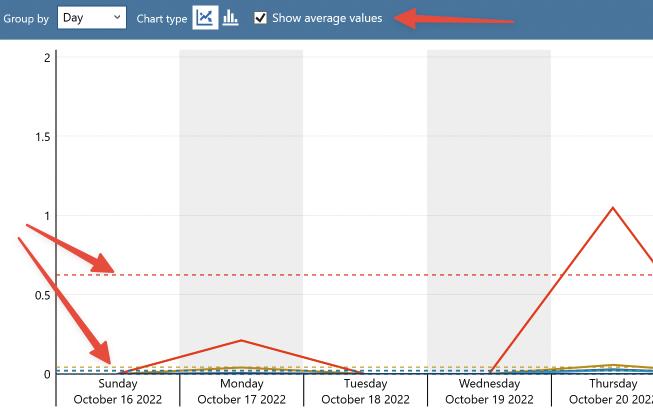
Chart type
Currently there are two charts available, line chart and bar chart. Click on the icons to toggle between them.
Average value
Check the "Show average values" checkbox to display average lines.
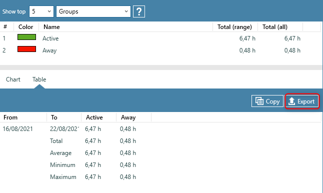
Export statistics
Exporting charts (images)
If you would like to export the chart, you can click on Export button on the left. Chart will be saved in .jpg format. You can also copy it to clipboard.
Exporting data
By default chart tab is shown, but you can also see the data that was used to create the chart. To see the data, click on the tab 'Table' just above the chart. Data will be shown in a grid like view. You can also export the data by clicking on the Export button. It will be saved in a .csv or .xlsx file, which you can then import in excel or some other application.